The Australian Digital Observatory Research Dashboard (ADOReD) is an interactive web based application designed to provide user friendly access to the ADO-API, to perform social media analysis. The dashboard allows users to interact with data present in the ADO databases, along with some of the topic modelling results and word embeddings that are generated by the ‘live’ machine learning pipelines. The dashboard works best a stable internet connection, and on a laptop or desktop computer, as it can be network intensive when it is querying for large amounts of data, and performing analysis on the client side.
Authentication
The ADOReD is accessible at https://www.ado.eresearch.unimelb.edu.au/dashboard/. On this page, a model will pop up and prompt for an API key to log in.
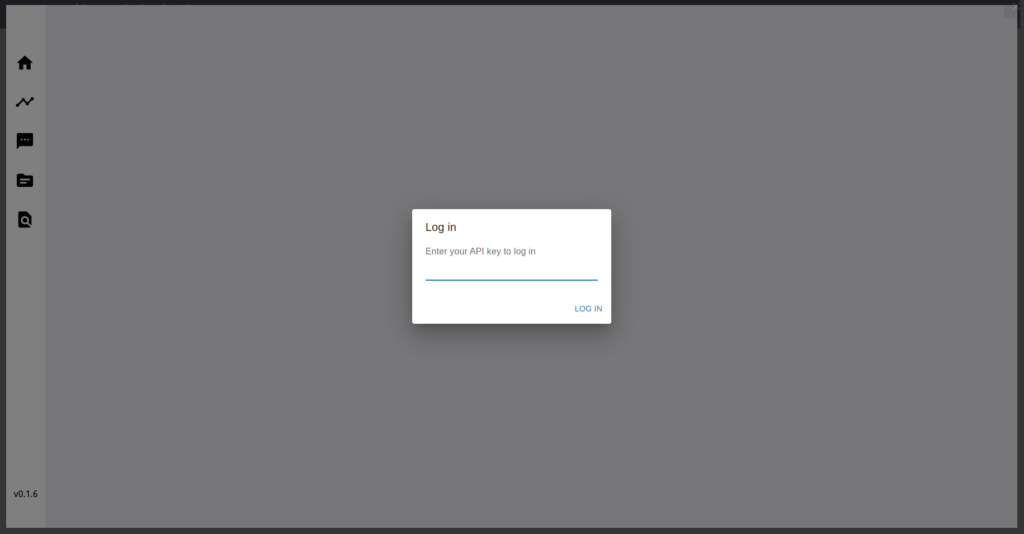
Note: The API key requires approval from the ADO team, and requires an approval via a request made through this form.
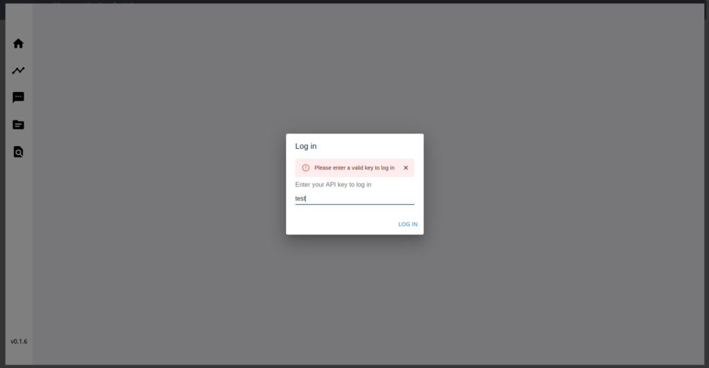
Once a valid API key is entered, click the “Log In” button, which will prompt the authentication server. If the key is invalid, the model will pop up again with an error message, as shown below.
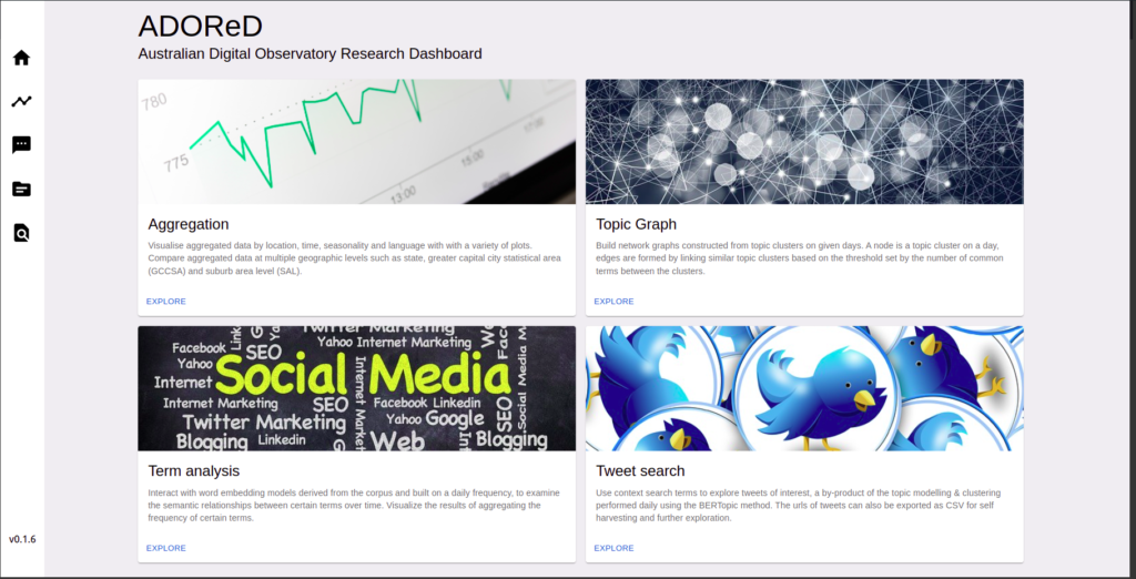
If a valid key is entered, and the authentication is successful, the home page of the dashboard will load as shown below.
The authentication will remain valid for 24 hours, setting a cookie in the browser, and therefore the model will not prompt for a key if the cookie is present in the browser. However, switching to incognito mode will cause the authentication model to prompt again, as no cookies are stored in this mode.
Analysis areas
ADOReD allows users to conduct analysis in the following areas, which are on different tabs:
Aggregation
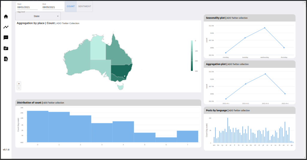
This tab enables users to aggregate data (number of social media posts) by location (only a small proportion of them have location information) , time, seasonality and language and visualize this data with a variety of plots. Users can compare aggregated data at multiple geographic levels i.e. state, greater capital city statistical area (GCCSA) and the suburb area level (SAL).
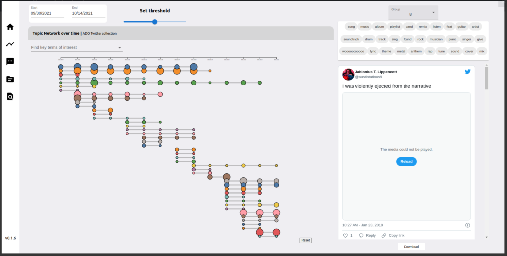
Topic Graph
On this tab, users can interact with the results of the ADO Topic modelling pipeline. This pipeline is “semi-live” i.e. topic modelling is conducted every day for the previous days data. Moreover a network graph is used to visualise the results of topic modelling. In the network graph, a node is a topic cluster on a given day, and edges are formed by linking similar topic clusters based on the threshold, which can be adjusted, set by the number of common terms between the clusters.
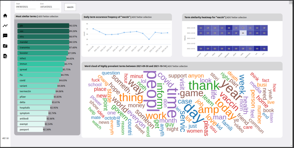
Term Analysis
In the ADO Topic Modelling pipeline, word embedding models are also generated from the social media corpus, constructed daily, and stored in the ADO database. This tab on ADOReD allows users to interact with these models (via the ADO API), with query terms. Frequencies of certain terms can also be visualized by day, along with a wordcloud with visualizes the aggregate frequencies of the most common terms.
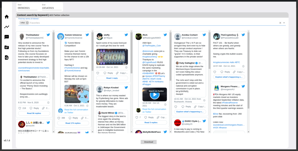
Tweet Search
On this tab on ADOReD, users can search for tweets in the ADO database using a context search term, and visualize some of the tweets (as well as download list tweet ids as a CSV file). This is a by product of the ADO Topic Modelling pipeline, and the context search term is different from a string search.
Stay tuned for more….
More detailed explanation and guides on how to use these tabs, along with the methodology used for them, will be delved into further in subsequent blog posts. Please refer to the Tutorials section for all other tutorials for ADOReD, as well as the ADO API.