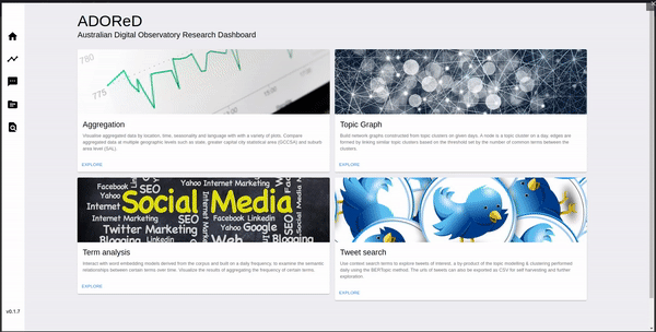
The aggregation tab in ADOReD provides ability to aggregate over the social media collections in four different ways, which called different endpoints at the ADO-API.
- Location
- Time (by day)
- Seasonality
- Language
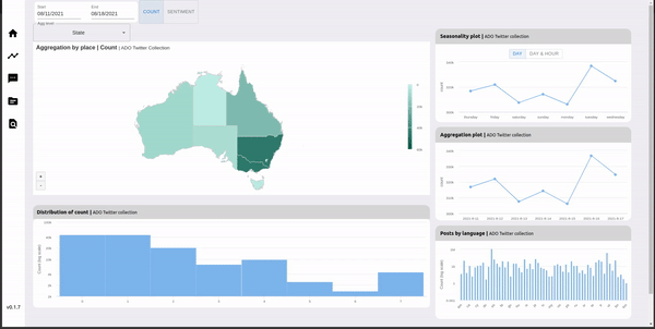
Each aggregation is controlled by a start and an end date, to specify the period over which the aggregation is desired. Upon loading the aggregation tab, one can select the start and end date by using the widget in the top left corner. Once these value are selected, all of the visualisation widgets in the tab will update to reflect the changed date.
NOTE: The limit for the difference between the start and end date is 21 days. If the difference is longer than that, an error prompt will be shown.
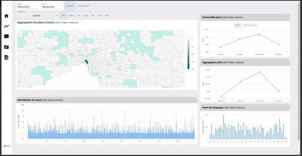
The location aggregation results are visualised in the two widgets on the left – the map and the bar chart. There are three geographic levels / statistical areas available for aggregation: state, greater capital city statistical areas (GCCSA) and the suburb area level (SAL) – as defined by the Australian Bureau of Statistics (ABS). The aggregation level can be set by the drop down menu below the date range picker as shown below.
Aggregation by sentiment
Each social media document in the ADO database contains a sentiment property, which is a score of the sentiment of the text in the document, in the range of -1 to 1. Similar to the count statistics, this sentiment can also be aggregated across all the aggregation levels, except for language. To swith the aggregation to sentiment, click the sentiment button located on the right of the date picker.
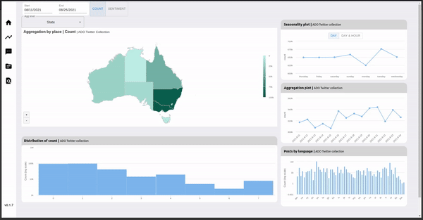
The value is mean sentiment, the total sentiment divided by the number of documents over which the total sentiment is calculated. Tooltips are present on each widget, which allow for viewing of the exact value of the data point when hovered over. For instance, one can hover over a particular location in the map to view the exact figure for the specific locality.
Switching between seasonality levels
The seasonality aggregation further allows for two types of aggregation levels. The levels are:
- dayofweek – number of posts / mean sentiment by the day of the week. e.g. “how many posts were there on a Monday vs Wednesday?”
- dayofweekhor – number of posts / mean sentiment by the day of the week and hour of day e.g. “how many posts were there on Monday 4pm vs Monday 10pm?”
Switching between the two seasonality levels can be done by using the buttons above the seasonality plot, after a date range is set in the date picker.

Limitations
It is important to note that selecting larger date ranges will increase the time to load and visualize the aggregation (the widget will show the loading spinner while bufferring). It is recommended to keep the date ranges small, and not to perform rapid changes in date range selection i.e. let all the widgets completely load, and wait 10-15 seconds before trying another request.