The ADOReD topic graph tab provides users with an interactive way to examine the outputs of the ADO Topic Modelling pipeline. The pipeline is run every day, on a days worth of social media data, using BERTopic, to generate a list of topic clusters. These clusters simulate the trending topics of the given day, and each cluster is associated with 30 representative terms – from which the topic of the cluster can be extrapolated.
Topic graph construction
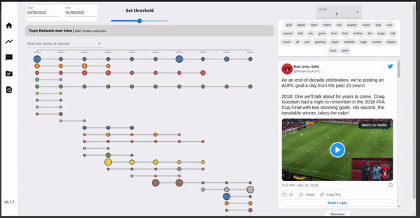
In order to track the evolution of topics over time, a network graph was deemed most suitable to link clusters on consecutive days. In a topic network graph, a node is a topic cluster on a day, and edges are formed by linking similar topic clusters based on the threshold. This threshold is the minimum number of common terms for an edge to exists between two nodes (or clusters). Therefore, provided a low threshold, nodes can have multiple edges between consecutive days. Furthermore each node is assigned to a grouping, which is determined by examining all the paths that the node is present in, and selecting the longest path as the grouping that the node is assigned to.
Dynamic graphs
The ADOReD topic graph generates a dynamic graph, based on the parameters (start date, end date and threshold) set, which is sent to the ADO-API. This API does the heavy lifting to generate the topic network graph, which is visualized on the dashboard. As shown below, changing the date ranges will produce a new topic graph.
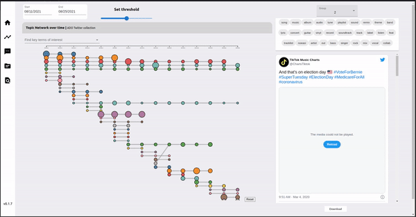
Lowering the threshold can make the nodes in the topic graph more connected, as less intersecting words are required to form and edge. This may be useful if trying to find topic clusters which are related to each other, even with lower similarity.
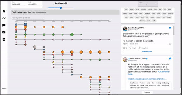
The topic clusters that belong to the same group fall on the same x-axis, while the y-axis is determined by the date of the topic cluster. The radius of the node is proportional to the number of documents present in that topic cluster.
Graph interactivity
The nodes / topic clusters can be hovered over to display a tooltip to display some metadata of the topic cluster. This includes the size, the topic cluster id, the group number and the representative terms for that topic cluster.
Groupings to documents
On the right of the topic graph is a panel where the tweets of certain topic groupings can be inspected more closely. The group number can be selected from the dropdown, and the top terms of the selected group are listed in the area below it. Underneath the terms list, a selection of tweets present in the group are embedded for visual inspection. The complete list of tweet urls can be downloaded by clicking the download button underneath the embedded tweets panel. Additionally, clicking a node in the graph will also load the group that the node is in the panel.
Given the list of twitter Ids, the tweets themselves can be harvested by specifying them for example as a parameter in a Lookup request. This model of using ADOReD for discovery of tweets related to specific topics and allowing to download their tweetIds addresses the Twitter policy of sharing of social media data, i.e. ADOReD is used for discovery of tweets and does not provide direct access/sharing of the tweets themselves.